Inhaltsverzeichnis
JavaFX
JavaFX is supported as of version 14.0 by the Java-Editor. The development of this new graphical user interface for the Java-Editor took many months. But I think that the work was worth it. You can now work with a contemporary GUI library, which can also be designed with CSS. Creating a GUI interface is made even easier for novice programmers because, by default, the Object-Inspector displays only the most important attributes of GUI components. This makes the GUI components much easier to configure. In addition, graphic basic figures such as circle, rectangle and polygon are now available, which can also be used to design simple GUI applications with graphic objects in the classroom.
As of JDK 11 JavaFX is no longer included in the JDK and must be additionally installed. You can download a JavaFX Windows SDK from https://gluonhq.com/products/javafx/ and install it in parallel to OpenJDK. In the configuration enter the JavaFX folder under Interpreter- JavaFX-folder.
A documentation of JavaFX can be downloaded at https://www.oracle.com/technetwork/java/javase/documentation/jdk8-doc-downloads-2133158.html. The path of the file docsfx\api\index.html is entered under Documentation - Manual Java FX.
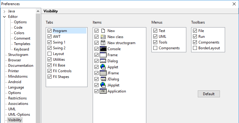
 Please note that in the configuration under Visibility you can set which tabs are displayed. For JavaFX you need FX Base, FX Controls and FX Shapes. You can disable the tabs for AWT and Swing here.
Gerhard Röhner 1.03.2017
JavaFX Base
Label
![]() A label component is used to label a component of a GUI form.
A label component can also display a picture or both.
To display an image, select the desired image file in the object inspector at the Graphic attribute.
The selected image file is automatically copied to the images folder.
A label component is used to label a component of a GUI form.
A label component can also display a picture or both.
To display an image, select the desired image file in the object inspector at the Graphic attribute.
The selected image file is automatically copied to the images folder.
TextField
![]() With a TextField component you can input or output text. To input text use the method getText(), to output text the method setText().
With a TextField component you can input or output text. To input text use the method getText(), to output text the method setText().
String Name = tfName.getText();
NumberField
![]() With a NumberField component you can easily input or output a number because the conversion to the desired numeric data type is done by the methods getDouble(), getFloat(), getInt() and getLong().
With a NumberField component you can easily input or output a number because the conversion to the desired numeric data type is done by the methods getDouble(), getFloat(), getInt() and getLong().
int Age = nfAge.getInt();
Decimal numbers can be output with a maximal or a specified number of decimal places:
Example:
nfSum.setDouble(Sum);    // maximal number of decimal places: 3657.42323426347834
nfSum.setDouble(Sum, 2); // two decimal places:               3657.42
TextArea
![]() A TextArea component represents multiline text, a TextField component a single-line text.
In the object inspector you can enter the text. At runtime you add text with appendText(),
set it with setText() or read it with getText().
The lines are separated by the control character „\n“ (new line).
A TextArea component represents multiline text, a TextField component a single-line text.
In the object inspector you can enter the text. At runtime you add text with appendText(),
set it with setText() or read it with getText().
The lines are separated by the control character „\n“ (new line).
  taOutput.setText("Output:\n\n");
  taOutput.appendText("Number " + Number+ " found! \n");
Button
![]() If you click on a button component in a GUI form, the event method belonging to the button will be executed.
If you click on a button component in a GUI form, the event method belonging to the button will be executed.
Each button component automatically receives an event method for clicking the button.
Example:
  public void button1_Action(Event evt) {
    // TODO add your code here
  } // end of button1_Action
When you double click a button in the GUI form, the cursor of the source text editor is placed at the beginning of the associated event method.
If you enter the caption of a button in the attribute Text in the object inspector, a suitable name for the button is automatically generated.
CheckBox
![]() A CheckBox component may or may not be selected. The current state is provided by the method isSelected().
A CheckBox component may or may not be selected. The current state is provided by the method isSelected().
if (myCheckBox.isSelected()) ...
Buttongroup
 A Buttongroup groups Radiobuttons or Checkboxes. Set the attribute Checkboxes to true if you want a group of Checkboxes. Enter your options using the Items attribute.
For a buttongroup of radiobuttons the Java-Editor places this method into the java source code:
  public String buttonGroup1TG_getSelectedButtonGroupLabel() {
    RadioButton rb = (RadioButton)buttonGroup1TG.getSelectedToggle();
    if (rb != null) return rb.getText();
    return "";
  }
so it's easy to get the selected JRadioButton of a Buttongroup:
if (bgColorTG_getSelectedButtonGroupLabel().equals("green"))
ListView
A ListView component displays a list of objects, mostly Strings. The user can select one or more objects. With the Items attribute in the object inspector you can enter strings into a ListView.
The data of the ListView is managed in an ObservableArrayList. At runtime one can manipulate the data with methods of the ObservableArrayList.
Examples:
Access via ObservableArrayList
  myListObservableList.add("Vera");
  myListObservableList.remove(0);
  String s = (String) myListObservableList.get(3);
Although the ObservableArrayList knows all the data, an item is selected in the ListView, not in the ObservableArrayList.
Access via ListView
int i = myList.getSelectionModel().getSelectedIndex();
String s = (String) myList.getSelectionModel().getSelectedItem();
If the ListView contains numbers, the selected string must be converted into a number:
  String s = (String) myList.getSelectionModel().getSelectedItem();
  int Number= Integer.parseInt(s);</code
----
==== ComboBox ====
{{:de:combobox.png}}

A ComboBox component is a combination of an input line and a drop-down selection list. The user can select a list element at runtime or enter text in the input line.

In the object inspector you can enter strings into the selection list via the attribute //Items//. To be able to enter something in the input line of a ComboBox, set the attribute //editable// to //true//.

The data of the ComboBox are managed in an //ObservableArrayList//. At runtime you can manipulate the data using methods of the ObservableArrayList.

Examples:

Access via ObservableArrayList
<code java>  myComboBoxObservableList.add("Vera");
  myComboBoxObservableList.remove(0);
  String s = (String) myComboBoxObservableList.get(3);
Although the ObservableArrayList knows all the data, an item is selected by the user in the ComboBox, not in the ObservableArrayList.
Accees via ComboBox
  int i = myComboBox.getSelectionModel().getSelectedIndex();
  String s = (String)myComboBox.getSelectionModel().getSelectedItem();
To be able to react automatically to an input or selection in a ComboBox an event method for action is created in the object inspector.
Spinner
With a spinner component one can select numbers from a range between minimum and maximum. In the object inspector you define minimum, maximum, increment (AmountToStepBy) and current value (InitialValue).
At runtime you can use the getValue() method to get the current value:
int value= mySpinner.getValue();
To react directly to spinner changes, use the mouseClicked event.
Canvas
A Canvas component provides a drawing area.
To draw on the drawing area you can get a graphic context from the Canvas component. This graphic context is used as a paintbox with many drawing possibilities.
You get the graphics context from your Canvas component named drawingarea in this way:
GraphicsContext gc = drawingarea.getGraphicsContext2D();
With the help of the graphical context gc you can draw a line, for example:
gc.strokeLine(40, 10, 10, 40);
Turtle
From version 14.04 we have an animatable turtle for programs with JavaFX interface.
As a didactic reduction there are the methods setOriginX(double x) and setOriginY(double y), which can be used to set up a coordinate system (green) known from mathematics lessons in the drawing area. The drawto and moveto commands of the Turtle refer to this coordinate system.
MenuBar
With a MenuBar component you can create a menu bar. The menu bar displays the menus (menu components) assigned to it.
ContextMenu
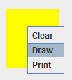
A ContextMenu component is used to create a context menu. In the example a TextField component responds to the right-click and displays the context menu.
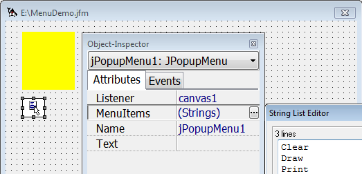
In the object inspector you enter the menu commands (eg Clear, Draw, Print) at the attribute MenuItems. For each menu command the Java Editor generates an associated event method.
If you display all attributes in the object inspector, you can enter the name of a context menu at the ContextMenu attribute.
MenuButton
 With a MenuButton component you can open a context menu.
In the object inspector enter the menu commands under MenuItems. For each menu command an event method is created.
SplitMenuButton
 A SplitMenuButton component is a combination of an ordinary button and a MenuButton.
In the object inspector enter the menu commands under MenuItems. For each menu command and the SplitMenuButton itself an event method is created.
JavaFX Controls
The control components of JavaFX extend the standard GUI components of JavaFX Base.
Slider
With a slider component you can select a continuous or discrete (SnapToTicks) numerical value between minimum and maximum by dragging with the mouse.
double value = slider1.getValue();
ProgressBar
With a ProgressBar component you can see the progress of an operation in the range 0 to 1 as a horizontal bar.
progressBar1.setProgress(0.3);
ToolBar
With a ToolBar component you can combine several buttons and separators.
ToolBar toolBar1 = new ToolBar();
toolBar1.getItems().addAll(bNew, bOpen, new Separator(), bPrint);
Separator
ToggleButton
PasswordField
ChoiceBox
Hyperlink
 A hyperlink component represents a text as a reference, which you can click on. Like a button, it triggers an event that can be responded to in an event method.
HTMLEditor
An HTMLEditor component allows editing and formatting of text. Formatting is done by marking it with HTML.
String s = hTMLEditor1.getHtmlText();
WebView
A WebView component can display the web page for an internet address. In the URL attribute of the object inspector enter the internet address with protocol, e.g. http://www.javaeditor.org.
ColorPicker
DatePicker
Pagination
FileChooser
 With a FileChooser component one can select a file.
This method is add to the source code:
public File fileChooser1_openFile() {
  return fileChooser1.showOpenDialog(null);
}
It can be used like this:
File f = fileChooser1_openFile();
FileChooser
 With a FileChooser component one can select a file.
This method is add to the source code:
public File fileChooser1_openFile() {
  return fileChooser1.showSaveDialog(null);
}
It can be used like this:
File f = fileChooser1_saveFile();
DirectoryChooser
 With a DirectoryChooser component you can select a folder.
This method is add to the source code:
public File directoryChooser1_openDirectory() {
  return directoryChooser1.showDialog(null);
}
It can be used like this:
File d = directoryChooser1_openDirectory();
ImageView
MediaView
TableView
 With a TableView component you can display a table.
In the GenericType attribute, specify the type of lines to be displayed.
The attribute tableView1Items stores the data to be displayed in the table.
TreeTableView
JavaFX Shapes
Graphics can be programmed with the shape components of JavaFX.
Circle
 A Circle component represents a circle. The Fill attribute sets its fill color, the Stroke its frame color.
If you place a Circle component on a canvas component, you can use the MouseMoved canvas event to move the circle.
public void canvas1_MouseMoved(MouseEvent evt) {
  circle1.setCenterX(evt.getX());
  circle1.setCenterY(evt.getY());
}
Rectangle
 A Rectangle component represents a rectangle. The Fill attribute sets its fill color, the Stroke its frame color.
Ellipse
 An Ellipse component represents an ellipse. The Fill attribute sets its fill color, the Stroke its frame color.
Polygon
 A Polygon component represents a closed polyline. The Points attribute specifies the coordinates of the waypoints. They refer to the rectangle surrounding the ployline.
Arc
 An Arc component represents a circular or elliptical arc. StartAngle is the start angle, Length the arc length in degrees, and Type specifies the arc type.
Line
 A line component represents a line. In addition to the color of the line (Stroke), there are some other attributes for their design.
Text
QuadCurve
 The Quadcurve component defines a quadratic Bézier parametric curve segment in (x,y) coordinate space. Drawing a curve that intersects both the specified coordinates (startX, startY) and (endX, enfY), using the specified point (controlX, controlY) as Bézier control point.
CubicCurve
 The CubicCurve component defines a cubic Bézier parametric curve segment in (x,y) coordinate space. Drawing a curve that intersects both the specified coordinates (startX, startY) and (endX, enfY), using the specified points (controlX1, controlY1) and (controlX2, controlY2) as Bézier control points.


